


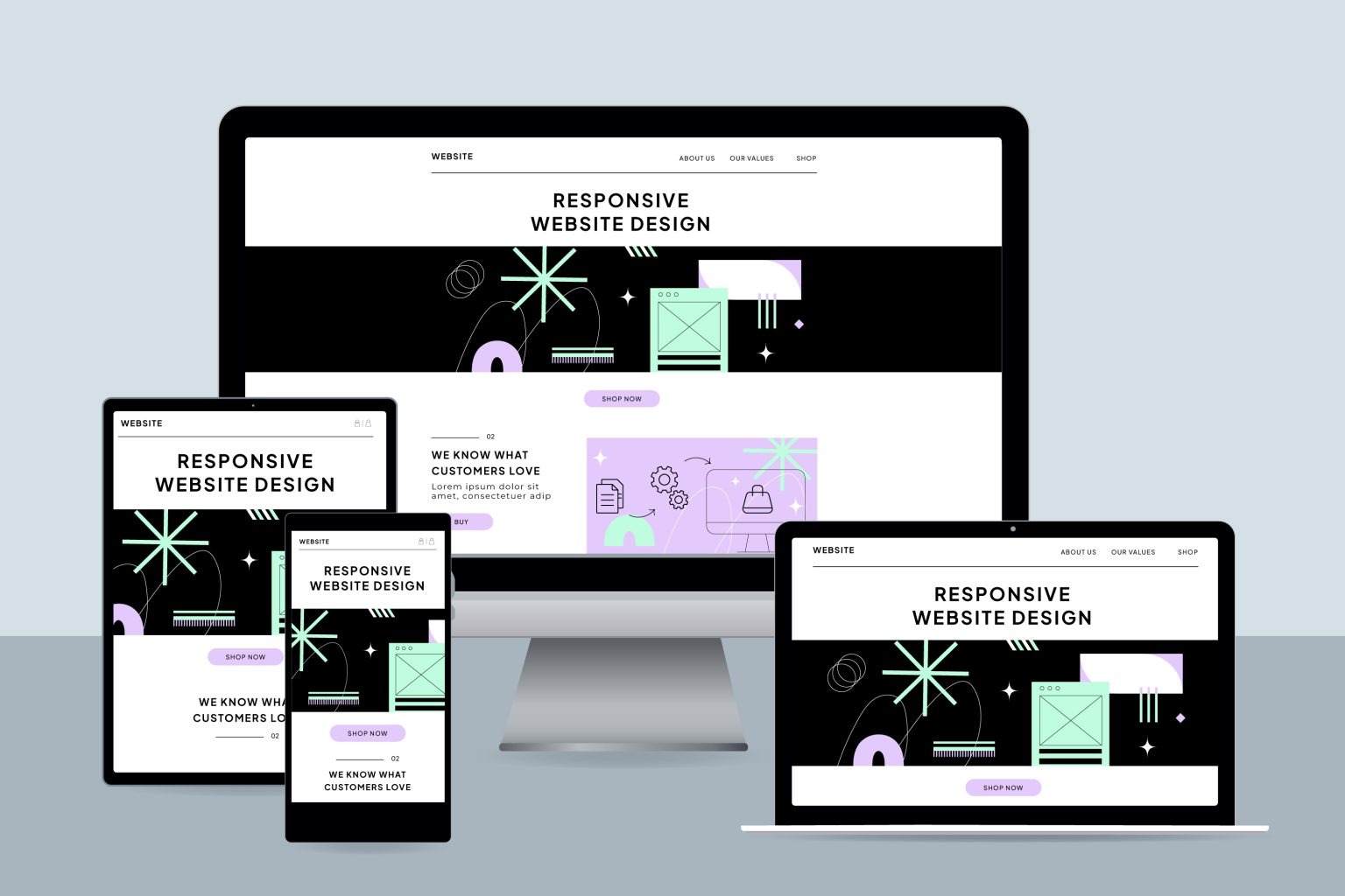
Houston Responsive Website Design Company
At Directory One, we specialize in website design in Houston, website design isn’t just an option—it’s a necessity for any business aiming to succeed online. Our array of web design packages, including customizable options, ensures your company shines brightly.
Our team of experienced web designers knows what works and how to create the ideal user experience with our website content writing services. We involve you in the process, demystifying the technical aspects and equipping you with the tools needed to continue growing your business. This collaborative approach ensures your website’s success without overwhelming you with unnecessary information.
Why Choose Responsive Website Design in Houston?
- Enhanced User Experience: A responsive design adjusts to different screen sizes, providing intuitive navigation and readability. This leads to higher user satisfaction and prolonged site visits.
- Improved SEO Performance: Search engines prioritize mobile-friendly websites. By adapting responsive design, your site is more likely to achieve higher rankings.
- Cost Efficiency: One single responsive website is easier and cheaper to maintain than separate versions for different devices.
- Future-Proofing Your Website: With continuous emergence of new devices, a responsive design ensures your site remains functional and visually appealing.
Key Elements for Local Online Success


Our Process for Creating a Responsive Website for Your Business
- Consultation & Strategy: We begin by understanding your business, target audience, and design preferences.
- Wireframing & Design: Expert designers craft visually appealing, mobile-friendly layouts.
- Development & Optimization: Using modern coding standards, we build fast and SEO-friendly websites.
- Testing & Quality Assurance: We test across devices, browsers, and screen sizes to ensure optimal performance.
- Launch & Support: After launch, we provide ongoing support and maintenance.
Frequently Asked Questions (FAQs)
Responsive web design ensures your website adapts seamlessly to different screen sizes and devices, providing the best user experience.
It improves user satisfaction, increases SEO rankings, and ensures your website works on all devices.
Google prioritizes mobile-friendly, responsive sites in search rankings.